Labour Market Forecast
Crafted by Bob Bu · Summer 2026
Public labour data looks simple on the surface. One monthly number, one region, one chart. The work starts after that. The data has to be pulled, checked, shaped into a forecasting task, tested against baselines, and explained without making the forecast sound more certain than it is.
I built this project around the Edmonton Economic Region unemployment rate. It follows the full path from public data to dashboard output. The page shows the latest reading, the next month forecast, model performance, source context, and the checks used before the briefing is displayed.
The dashboard is built in Streamlit. It reads saved CSV, JSON, and Markdown artifacts from the pipeline. That makes the demo stable. A visitor opening the page is not triggering a retrain. The training, validation, retrieval, and briefing steps are run first, then the dashboard renders the results.
The current dataset contains monthly Edmonton unemployment records from 2011 through 2026. The overview section focuses on the latest observed rate, the previous month change, the selected forecast, the chosen model, the data quality result, and the briefing validation score.
I kept the project small on purpose. Small data makes mistakes easier to see. It also forces the model comparison to be honest. A simple baseline can beat a heavier model, so the dashboard keeps those baselines in the same report as the machine learning models.
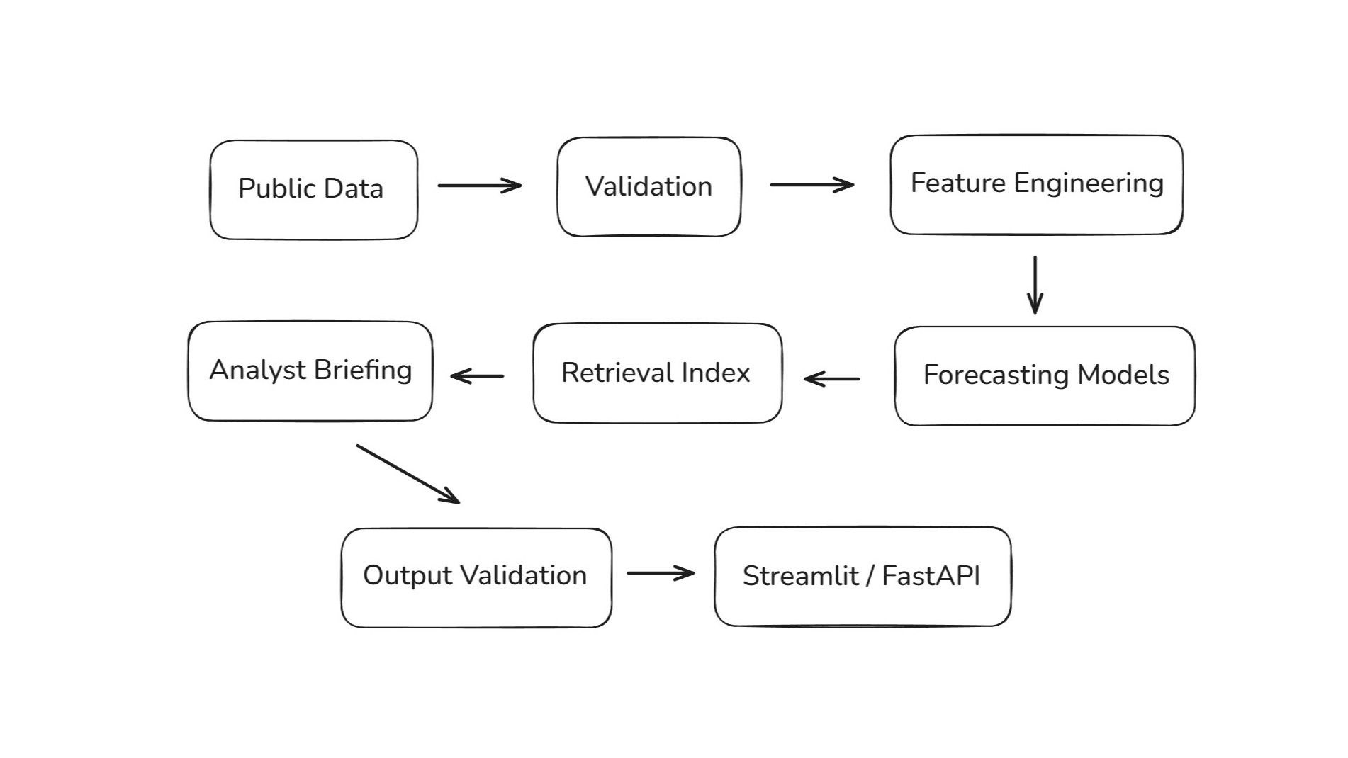
The first step is the data layer. A Python script collects the public unemployment series and writes both raw and processed files. A validation script checks the schema, missing values, duplicate rows, monthly date continuity, and value ranges. The result is saved as a readable quality report.
The forecasting table is built from lag values, rolling averages, calendar fields, and a next month target. This gives the models enough recent history to work with while keeping the feature set easy to explain. The target is direct: estimate the next unemployment reading.
def build_features(df):df = df.sort_values("date").copy()df["lag_1"] = df["unemployment_rate"].shift(1)df["lag_2"] = df["unemployment_rate"].shift(2)df["lag_3"] = df["unemployment_rate"].shift(3)df["rolling_mean_3"] = df["unemployment_rate"].rolling(3).mean()df["rolling_mean_6"] = df["unemployment_rate"].rolling(6).mean()df["pct_change_1"] = df["unemployment_rate"].pct_change()df["month"] = df["date"].dt.monthdf["quarter"] = df["date"].dt.quarterdf["year"] = df["date"].dt.yeardf["target_next_month"] = df["unemployment_rate"].shift(-1)return df.dropna().reset_index(drop=True)def evaluate_model(y_true, y_pred):error = y_true - y_predmae = np.mean(np.abs(error))rmse = np.sqrt(np.mean(error ** 2))mape = np.mean(np.abs(error / y_true)) * 100return {"mae": round(float(mae), 4),"rmse": round(float(rmse), 4),"mape": round(float(mape), 4),}
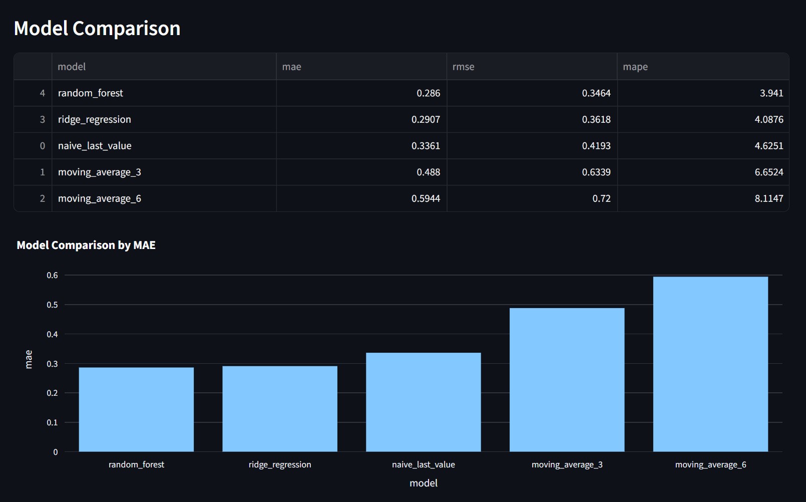
The project compares several forecasting approaches. It includes a last value baseline, moving averages, Ridge Regression, Random Forest, and a small PyTorch MLP. The baseline results stay visible because they set the standard the learned models have to beat.
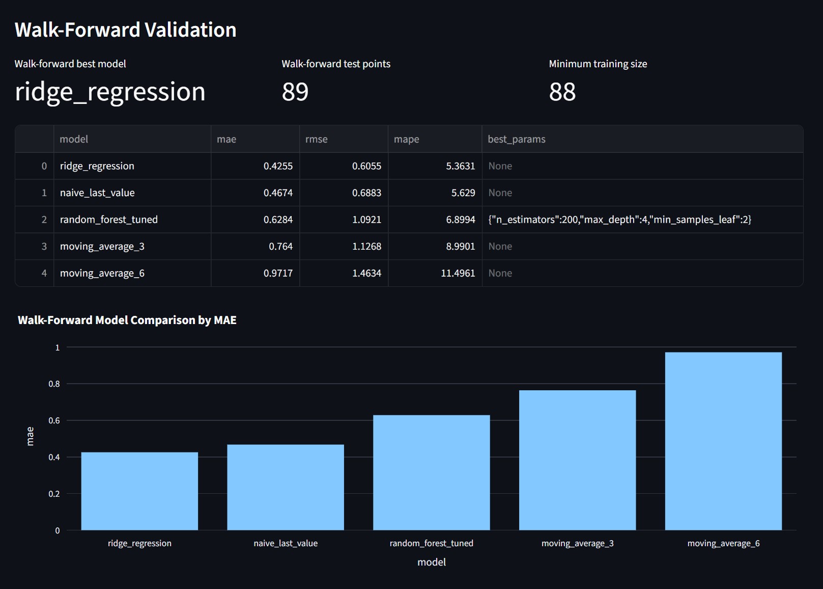
Model selection uses walk forward validation. Each test point is predicted using only records that came before it. This matches the way the forecast would be used after deployment. In the current run, Ridge Regression gives the strongest walk forward result and becomes the deployable model.
The dashboard also keeps the static split results. They are useful for a quick comparison, but the walk forward table carries more weight. Seeing both views makes the model choice easier to question and easier to defend.
Each training run writes out model metrics as JSON and Markdown. The Streamlit app reads those files directly. This keeps the dashboard tied to the actual pipeline output. It also makes the result easy to update when new monthly data arrives.
The PyTorch MLP is included as a controlled experiment. It shows that I tested a neural model in the same workflow, with the same target and metrics. The final selection still comes from validation performance, not from the model name.
Source retrieval is handled with a TF IDF index. The pipeline collects public labour market and economic pages, splits the text into chunks, and ranks the chunks for a labour market query. Those retrieved snippets feed the briefing section as source context.
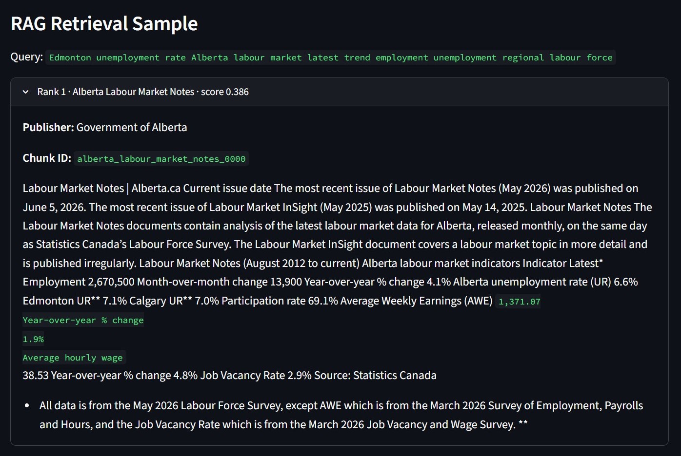
This screenshot shows the retrieval step before the briefing is assembled. The query pulls labour market notes, Alberta dashboard data, and Job Bank context. I keep the chunk ID and publisher visible so the source path can be checked later.
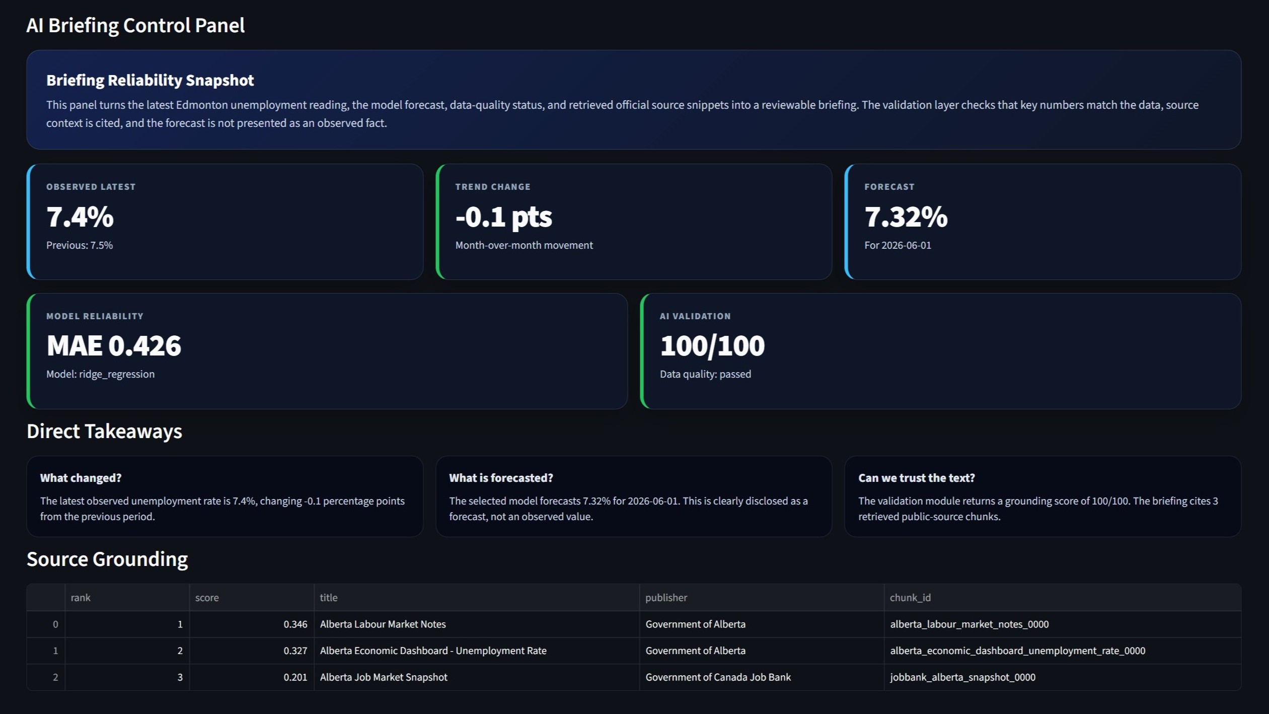
The briefing is generated from structured inputs. It uses the latest value, the previous value, the forecast, walk forward metrics, data quality status, and retrieved source snippets. The text is predictable because the generator follows a controlled template.
The validation step checks the briefing before display. It looks for numeric consistency, source grounding, forecast disclosure, caveats, and data quality notes. The score is shown on the dashboard so the generated text is treated as an auditable output.
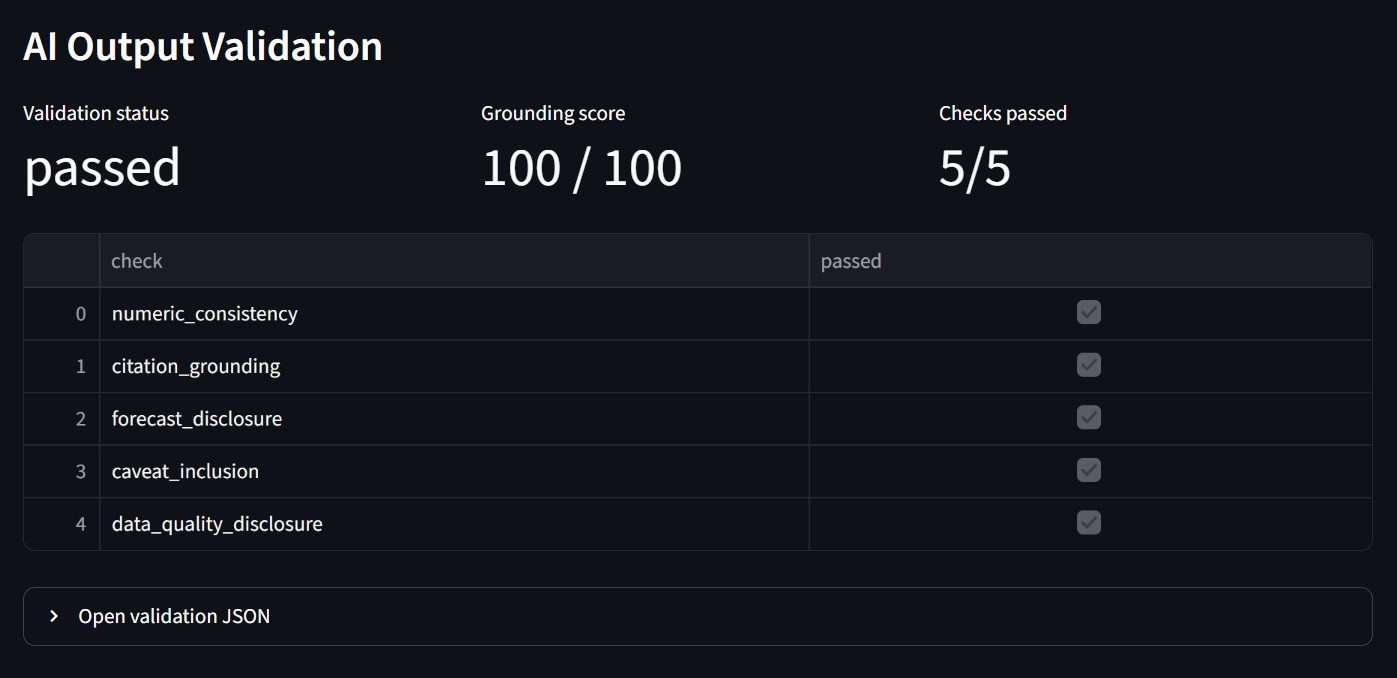
The validation panel makes the briefing result easier to inspect. It shows which checks passed and keeps the score visible directly.
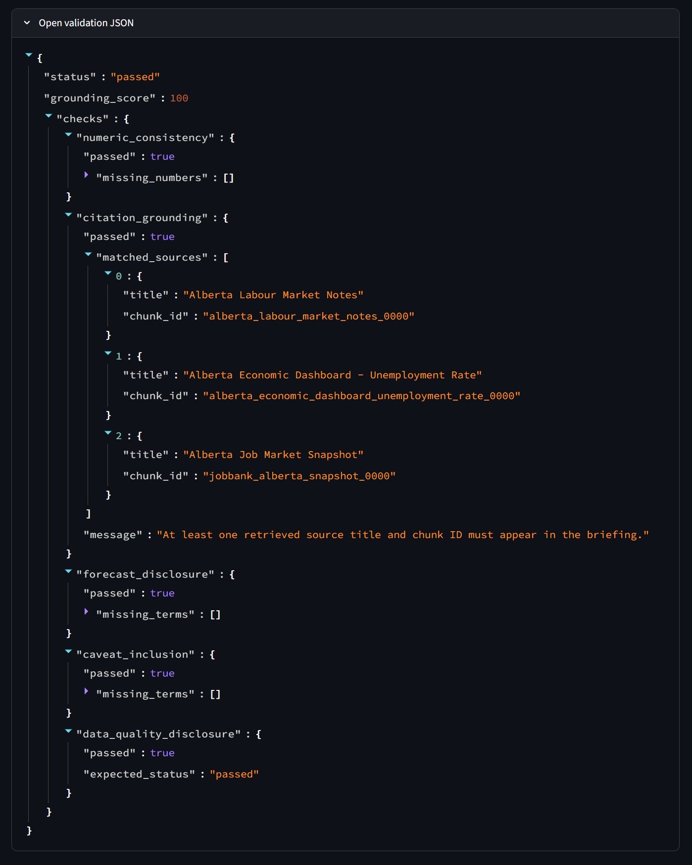
The same result is also saved as JSON. That file records each check separately, including matched source titles and chunk IDs. It is useful for debugging because a failed briefing can be traced to a specific rule.
I added FastAPI endpoints for health checks, indicators, prediction output, model evaluation, retrieval, briefing text, and data quality results. The API makes the project easier to extend beyond Streamlit. A separate frontend could read the same outputs later.
The repository also includes pytest checks and a GitHub Actions workflow. The tests confirm that required reports exist and that the API responds as expected. When new data is available, the pipeline can be rerun locally, the artifacts can be refreshed, and the dashboard can be redeployed.
Live deployment: Edmonton Labour-Market Intelligence
Edmonton, AB, Canada